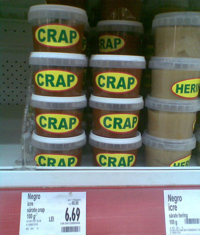
Have a Happy Not Horrifying Halloween: Avoid These Packaging Design Mistakes
Schadenfreude: The self-satisfaction you get when witnessing the embarrassment of another.
Nobody’s perfect, and let’s be honest here — we’ve all laughed at another person’s silly mistake. But when you're on the receiving end of someone’s schadenfreude, it’s no laughing matter.
If you’re in the process of designing packaging for your brand, you don’t want to embarrass yourself. People’s brains are impacted, for better or for worse, by packaging design.
So in the spirit of Halloween, we’ve rounded up some of the most horrifying packaging design mistakes we could find. If you can avoid these common packaging design fails, you’ll be well on your way to increasing customer trust and enticing shoppers to buy from you.
1. No Pun Intended from The Family Fruit Basket LLC
Image courtesy of pulptastic.com
True, zombies are a popular fixture in Halloween legends and lore. But seriously, Family Fruit Basket LLC? This is just in poor taste. No pun intended.
2. Child. The Other White Meat.
Image courtesy of pulptastic.com
At least they spelled child correctly. But egregious terminology errors on packaging are a major design fail. This type of packaging design mistake is easily avoided.
Get several different pairs of eyeballs on your design before it’s finalized. It also doesn’t hurt to invest in a translation service if you’re trying to break into a foreign market.
3. It’s a Bird! It’s a Plane! It’s a . . . Princess?
Image courtesy of pulptastic.com
Some companies just seem to hate their customers. Razzle dazzle them doesn’t mean confuse the heck out of them. Before finalizing your packaging design, make sure it won’t lead to a bunch of raised eyebrows from viewers.
4. What happens when the lights are one but nobody in the design department is home: Placement Faux Pas
Image courtesy of pulptastic.com
Poor placement can be a barrel of laughs — for your competitors. Failing to think through where assets will be placed on the final packaging design just looks sloppy and won’t win you any favors with customers. Your brand will look careless and unprofessional.
5. Honesty: The Best Policy
Image courtesy of pulptastic.com
At least, that’s what this brand’s competitors thought.
This is a massive oversight on the part of the company. Although this example is a labeling and not necessarily packaging design fail, it’s still relevant.
Don’t rush the process of labeling and packaging design, and you won’t end up with something this horrifying. These types of punny faux pas can severely damage your brand’s image and torpedo customer trust.
Take These Steps to Avoid Major Packaging and Labeling Design Fails
Give yourself enough time to get the details right on your final packaging design. Many mistakes can be avoided if you don’t rush the proof process.
Also, go through several rounds of revisions. No brand is an island when it comes to packaging design, so you’ll want to have several pairs of eyeballs on it before you finalize. Other people may pick up on some significant mistakes that you can’t see from your perspective.
A few final tips:
Incorporate enough white space on your labels and packaging for a sleek, clean design.
Run through several beta tests to ensure that your packaging is consumer-friendly and easy to open.
Think through the placement of things like pull out handles, so the packaging doesn’t end up looking stupid on the shelf.
Proof-read, spell-check, and test your packaging many times during the proof process to avoid some of the most embarrassing packaging design mistakes. We can help.
Call us at 885-417-8080, email info@inkwiselabel.com, or contact us online to start your label order. We’ll be happy to help you avoid these horrifying packaging and labeling mistakes so your brand will look professional and trustworthy.


